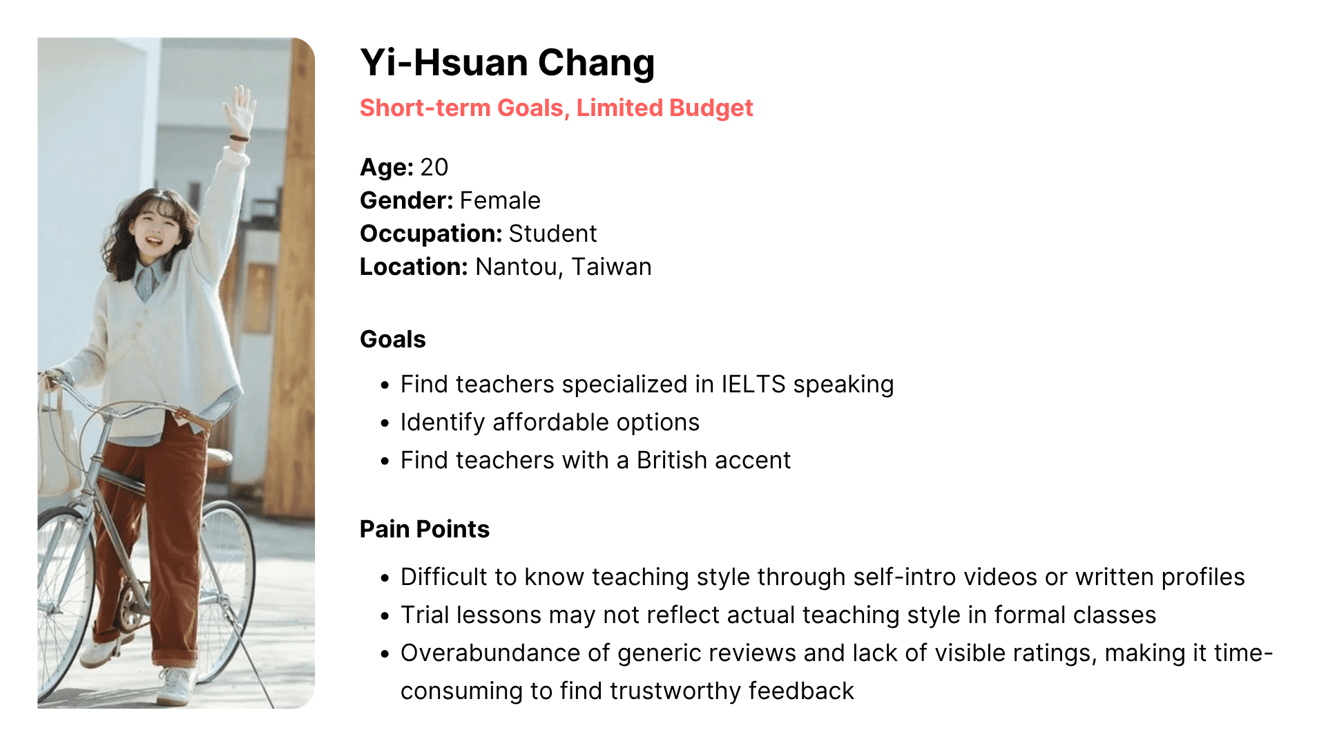
User Research
Users were segmented into 4 groups based on usage duration and price sensitivity.
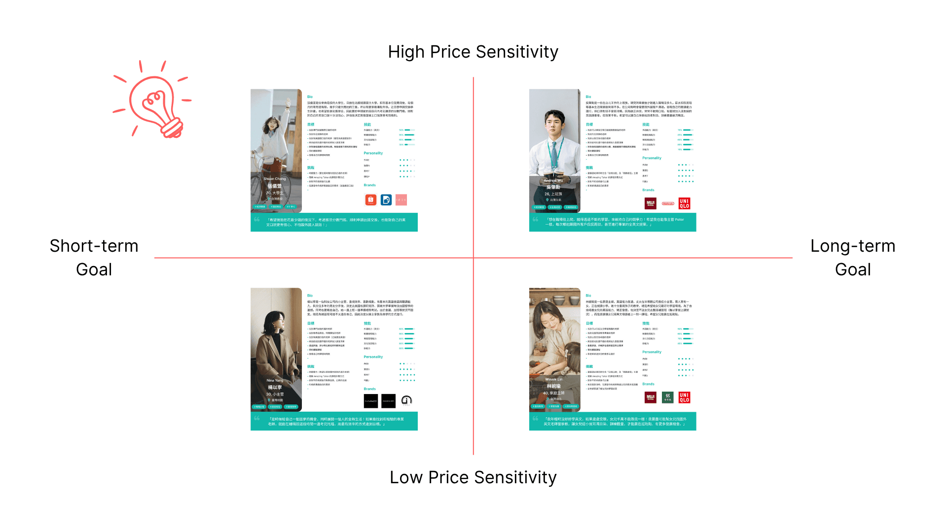
I focused on those who use the platform for short-term goals (e.g., exam preparation) but have limited budgets and analyzed their goals and pain points to inform design decisions. A primary persona was created for better understanding of those users.
Key Insights
Users prefer to use the web version over the mobile app when searching for instructors.
Users aged 18–24 are highly price-sensitive and primarily use the platform for short-term goals, such as exam preparation.
Compared to purchasing trial lessons, this age group prefers to evaluate instructors through reviews and self-introduction videos.
Objective
Enabled budget-conscious users with short-term goals to efficiently understand different teaching styles through reviews.
Design Ideation
Allow users to add in-class video snippet to their reviews
Add a "like" button for each review card
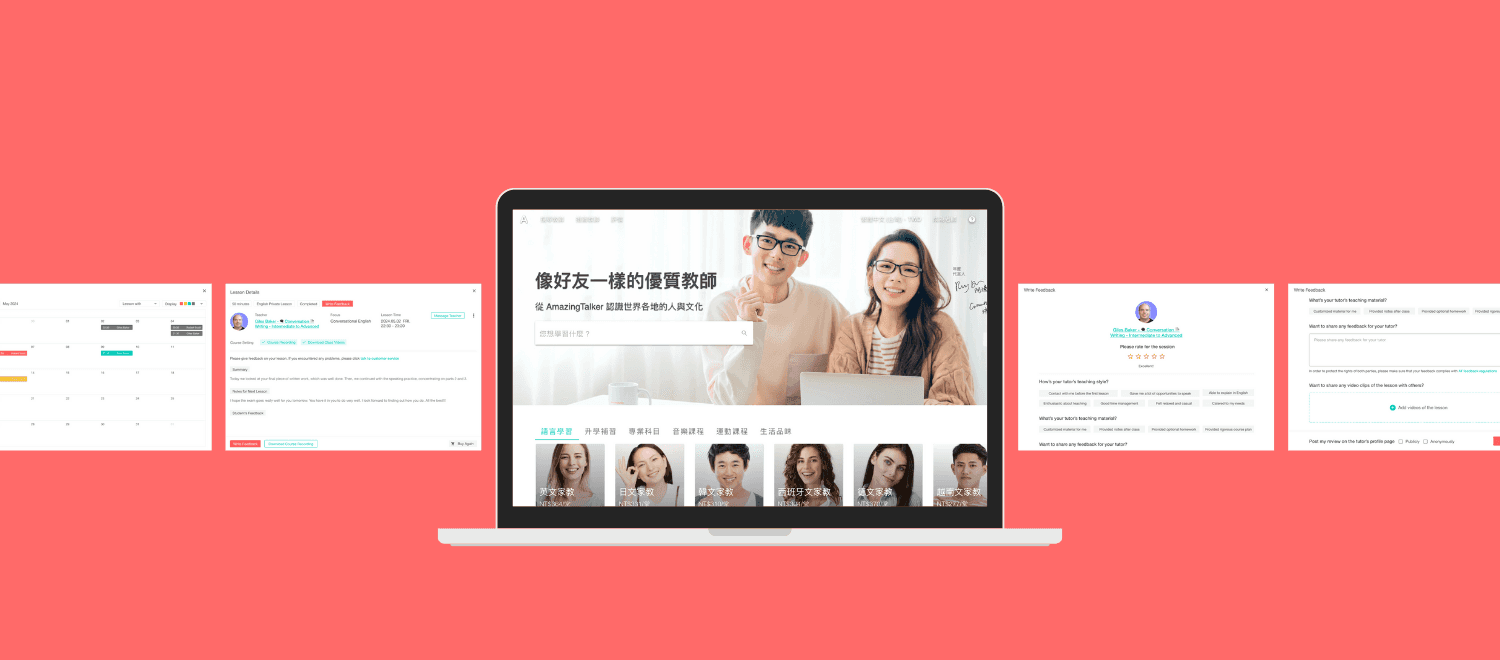
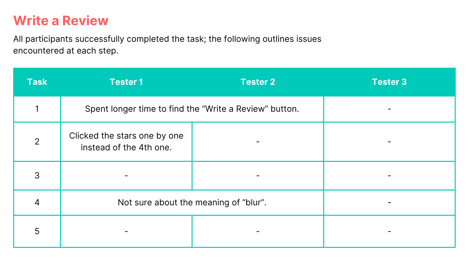
Usability Test
Write a Review
Conducted usability testing with 3 participants for the following tasks:
Navigate to the course page on May 2nd and go to the “Write Feedback” page
Give the teacher a 4-star rating and select the following tags: “Provided many speaking opportunities,” “Passionate about teaching,” and “Assigned homework”
Write a review with a course video snippet
Select the second AI-recommended clip and choose the option to blur your face
Choose to publish the review publicly and submit
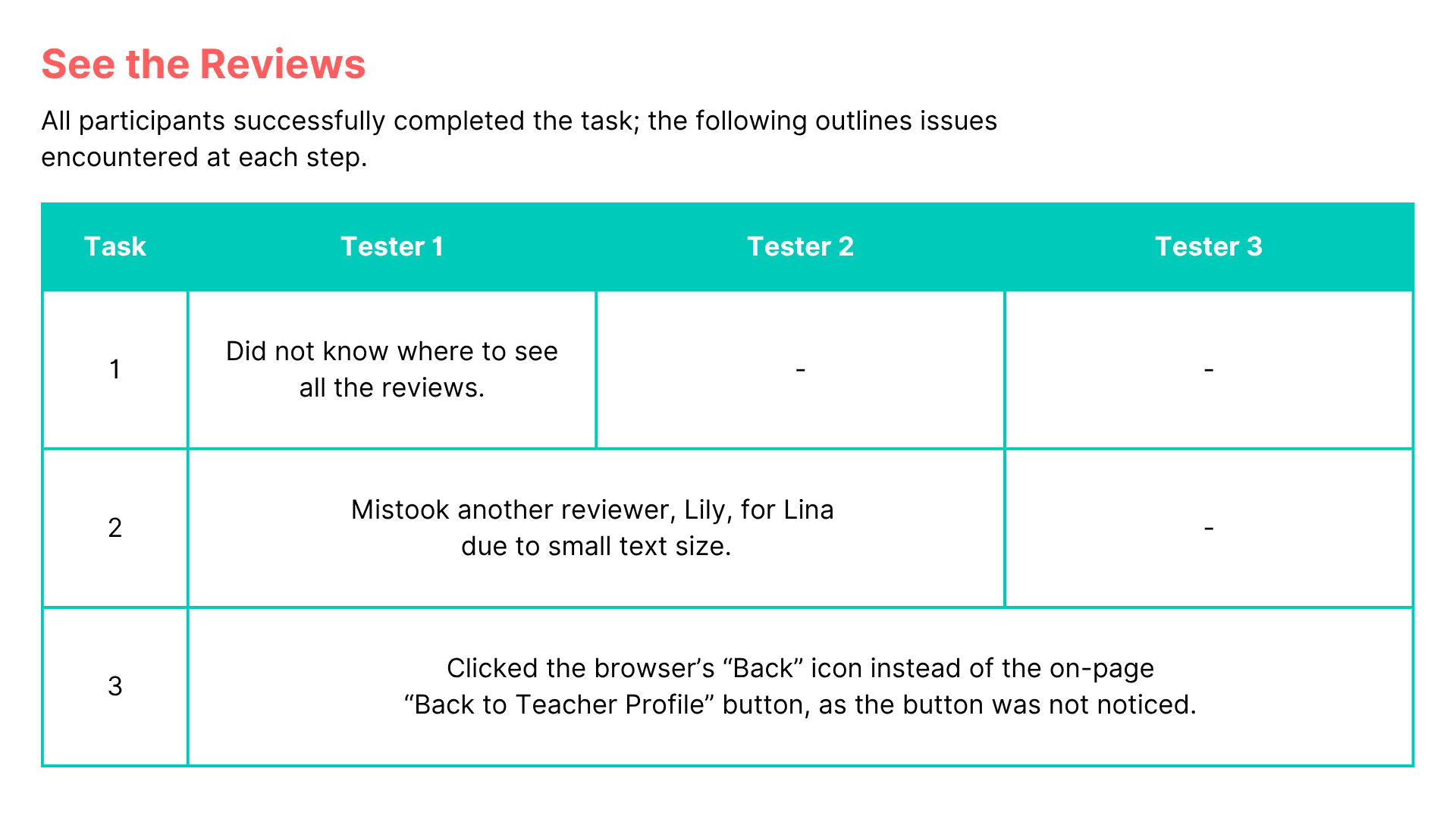
See the Reviews
Conducted usability testing with 3 participants for the following tasks:
Browse all reviews
Like the review written by Lina Cheng
Return to the review section on the teacher's profile page
Iteration
1. Interface Language
Most users are from Taiwan
→The interface should default to Chinese rather than English.
2. Write Review Button
The “End of Class” page contains too much information, making it difficult for users to quickly locate the “Write Review” button
→ Place the button at the top of the page for better visibility.
3. Review Filter Button
The filter text is lengthy and not immediately recognizable as clickable. Users suggested adding visual cues.
→ Add a “Filter” label and changed it to a dropdown menu for clarity.
4. Return to Teacher Page
Users had difficulty finding a way back to the teacher’s profile from the “All Reviews” page
→ Add a “Back to Teacher Page” button at the top of the page.